Summer 2026 Color Palette: 7 Defining Fashion Hues
Advertisements
The Summer 2026 color palette is poised to introduce a transformative array of hues, blending natural serenity with digital vibrancy, shaping the season’s fashion narratives and consumer choices.
As we look ahead to the warmer days, anticipating the trends that will define our wardrobes and aesthetics, the
summer 2026 color palette emerges as a fascinating subject. Fashion is a dynamic reflection of our collective mood and aspirations, and the colors we embrace tell a significant story. For Summer 2026, we are witnessing a captivating shift, moving towards hues that evoke both tranquility and spirited optimism, deeply rooted in a desire for connection with nature while subtly embracing technological advancements. This season promises a refreshing departure, inviting us to explore a spectrum that is both comforting and exhilarating, shaping not just what we wear, but how we feel and interact with the world around us. Let’s delve into the seven definitive hues that are set to dominate the fashion landscape.
the return of natural serenity: earthy and calming tones
The fashion world for Summer 2026 is seeing a significant embrace of natural serenity, with earthy and calming tones taking center stage. This trend reflects a broader societal yearning for stability, comfort, and a deeper connection to the environment. These hues offer a grounding presence, providing a sense of peace and timeless elegance amidst the fast-paced modern world. They are not merely colors but expressions of a lifestyle choice, advocating for sustainability and mindful consumption.
This movement towards natural shades is also a response to the growing awareness of environmental issues. Designers are increasingly incorporating eco-friendly materials, and these colors naturally complement such initiatives, creating a cohesive narrative of conscious fashion. The appeal lies in their versatility and the ability to seamlessly integrate into various styles, from minimalist to bohemian, making them accessible to a wide audience.
sustainable fashion and earthy palettes
Sustainability has become a cornerstone of modern fashion, and earthy palettes are its perfect visual counterpart. These colors, often derived from natural dyes or reflecting natural landscapes, reinforce the commitment to eco-conscious practices. They speak to a desire for longevity in clothing, moving away from fast fashion towards pieces that endure both in quality and style.
- Organic Cotton Tones: Soft beiges, creams, and off-whites that mimic untreated natural fibers.
- Mineral Pigments: Hues reminiscent of natural clays, stones, and desert landscapes.
- Botanical Inspiration: Subtle greens and muted browns drawn from foliage and tree barks.
The integration of these sustainable elements with natural colors creates a powerful statement, allowing consumers to make choices that align with their values. This approach not only enhances the aesthetic appeal but also adds a layer of ethical consideration to fashion.
versatility in styling: from casual to chic
One of the most compelling aspects of these calming tones is their incredible versatility. They can be dressed up or down, serving as a sophisticated base for more vibrant accents or standing alone as a statement of understated elegance. This adaptability makes them essential for a well-rounded summer wardrobe.
Imagine a linen suit in a muted sand tone for a formal summer event, or a flowing dress in a gentle sage green for a casual brunch. These colors effortlessly transition between different settings and occasions, proving their enduring appeal. Their neutrality allows for endless pairing possibilities, encouraging creativity in personal styling. The emphasis on natural serenity through earthy and calming tones underscores a significant shift in fashion towards mindful aesthetics and versatile, timeless pieces.
sun-kissed marigold: the optimistic glow
Emerging as a beacon of joy and optimism for Summer 2026, Sun-Kissed Marigold is a vibrant yet warm hue that captures the essence of long, bright summer days. This particular shade of yellow-orange is not overtly loud but possesses an inviting glow, reminiscent of golden hour sunsets and blooming marigold fields. It symbolizes renewed energy, positivity, and a playful spirit, making it an instant mood booster in any wardrobe.
Designers are incorporating Sun-Kissed Marigold into various fabrications, from flowing silks to structured cottons, demonstrating its adaptability. Its inherent warmth makes it flattering across diverse skin tones, further contributing to its widespread appeal. This color is a clear departure from more subdued palettes, signaling a collective desire for vibrancy and light in our post-pandemic world, injecting a much-needed dose of cheerfulness into fashion.
the psychology behind marigold’s rise
Colors often carry deep psychological associations, and Sun-Kissed Marigold is no exception. Yellows and oranges are historically linked with happiness, creativity, and energy. This specific shade, with its balanced warmth, evokes feelings of comfort and optimism without being overwhelming. It suggests a subtle confidence and an eagerness to embrace life’s brighter moments.
- Energy and Vibrancy: Stimulates feelings of liveliness and dynamism.
- Creativity and Playfulness: Encourages imaginative expression and a lighthearted approach to style.
- Warmth and Comfort: Provides a sense of coziness and well-being, like basking in sunlight.
In a world constantly seeking positivity, Sun-Kissed Marigold offers a visual antidote to gloom, making it a powerful choice for fashion that aims to uplift and inspire. Its presence in collections is a testament to fashion’s role in reflecting and influencing our emotional states.
styling sun-kissed marigold: pairings and accents
Integrating Sun-Kissed Marigold into an existing wardrobe is surprisingly easy due to its harmonious nature. It pairs beautifully with neutrals like cream, beige, and white, allowing the marigold to truly pop. For a bolder statement, consider pairing it with deep blues or even a soft lavender for an unexpected yet sophisticated contrast.
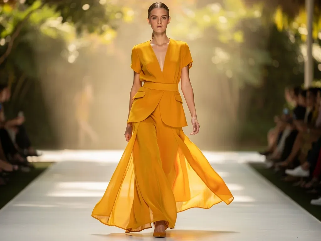
Accessories in Sun-Kissed Marigold can also transform an outfit, adding a touch of summer brilliance without committing to a full ensemble. Think handbags, scarves, or statement jewelry. This color can also be incorporated through patterns and prints, offering a softer introduction for those hesitant to embrace a solid block of color. Sun-Kissed Marigold is poised to be a defining hue for Summer 2026, bringing an optimistic glow to the season’s fashion.
oceanic teal: depth and tranquility
Oceanic Teal surfaces as a prominent hue for Summer 2026, offering a sense of profound depth and tranquil elegance. This captivating color, a rich blend of blue and green, mirrors the mysterious allure of the deep ocean and the serene beauty of tropical lagoons. It evokes feelings of calm, introspection, and a connection to the vastness of nature, providing a sophisticated counterpoint to the season’s more energetic shades.
Its versatility allows it to be both striking and soothing, making it a favorite among designers for various garments, from swimwear to evening wear. Oceanic Teal is particularly effective in evoking a sense of luxury and refinement, often seen in lustrous fabrics that highlight its inherent richness. This color speaks to a desire for escape and rejuvenation, offering a visual journey to serene aquatic environments.
the allure of aquatic shades
The human fascination with water and its calming properties is timeless, and Oceanic Teal taps directly into this primal connection. Its deep, cool tones have a naturally soothing effect, making it a perfect choice for summer fashion when relief from the heat is often sought. This shade is not just about aesthetics; it’s about creating an emotional experience through color.
- Calming Influence: Reduces stress and promotes a sense of peace.
- Natural Connection: Evokes images of oceans, lakes, and natural water bodies.
- Sophisticated Elegance: Adds a touch of luxury and depth to any design.
Designers are utilizing Oceanic Teal to craft garments that feel both grounded and ethereal, allowing wearers to embody a sense of effortless grace. Its presence suggests a leaning towards thoughtful design that prioritizes both beauty and emotional well-being.
digital lavender: futuristic calm
Stepping into the future with a gentle embrace, Digital Lavender is set to be a key player in the Summer 2026 color palette. This ethereal shade of purple, tinged with a hint of gray, represents a harmonious blend of technology and tranquility. It embodies a futuristic calm, bridging the gap between our increasingly digital lives and our innate need for peace and serenity. Digital Lavender offers a fresh, innovative perspective on pastels, making them feel modern and relevant for the contemporary consumer.
Its subtle yet distinct presence makes it ideal for a wide range of applications, from delicate flowy fabrics to more structured pieces, and even in accessories that provide a soft pop of color. This hue speaks to a generation that values both digital connectivity and mental well-being, finding beauty in the balance. It’s a color that invites introspection while simultaneously looking forward.

the intersection of technology and nature
Digital Lavender perfectly encapsulates the ongoing dialogue between the digital realm and the natural world. It’s a color that feels synthetic yet organic, reminiscent of virtual landscapes and digital sunsets, while still retaining the soothing qualities of traditional lavender. This duality makes it incredibly compelling for modern fashion.
- Tech-Inspired Aesthetics: Reflects the soft glow of screens and digital interfaces.
- Natural Soothing: Retains the calming essence associated with lavender flowers.
- Modern Versatility: Adapts seamlessly to both casual and high-fashion contexts.
This color is particularly resonant as we navigate a world where digital experiences are increasingly intertwined with our daily lives. Fashion, in turn, reflects this reality, offering colors that acknowledge and celebrate this integration without losing touch with our intrinsic need for calm.
styling digital lavender: ethereal and chic
Digital Lavender’s soft yet sophisticated nature makes it incredibly versatile for styling. It pairs beautifully with other pastels for a monochromatic, dreamy look, or with crisp whites and grays for a clean, minimalist aesthetic. For a bolder statement, consider combining it with deeper purples or even a touch of metallic silver, enhancing its futuristic appeal.
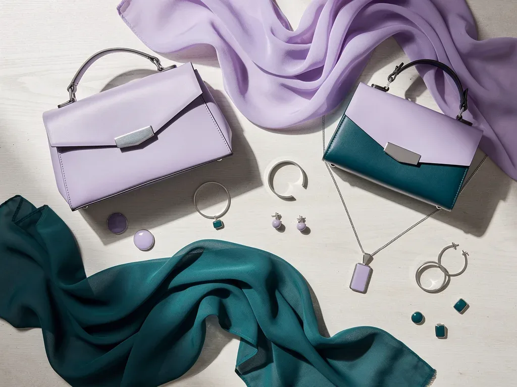
Accessories like statement jewelry, handbags, or footwear in Digital Lavender can elevate any outfit, adding a touch of contemporary elegance. It also works wonderfully in athleisure wear, bringing a sense of calm to active lifestyles. Digital Lavender is more than just a color; it’s a mood, a statement, and a glimpse into the future of fashion that values serene sophistication.
vivid fuchsia: energetic rebellion
For those seeking to make a bold statement, Vivid Fuchsia bursts onto the Summer 2026 scene with an energetic and rebellious spirit. This intense, electrifying pink is a celebration of individuality, confidence, and unapologetic self-expression. It’s a hue that demands attention, injecting a powerful dose of vibrancy and playfulness into the season’s fashion narrative. Vivid Fuchsia is about breaking free from conventions and embracing joy with open arms.
Its audacious nature makes it perfect for standout pieces, from evening gowns to daring accessories. Designers are leveraging its high-impact presence to create collections that exude confidence and a sense of liberation. This color is a direct reflection of a desire for exuberance and a rejection of subtlety, resonating with those who wish to express their inner strength and creativity through their style choices.
the power of bold pinks
Bold pinks, and fuchsia in particular, have a storied history in fashion as symbols of femininity, passion, and defiance. In Summer 2026, Vivid Fuchsia takes on an added layer of meaning, representing a vibrant rebellion against the mundane. It’s a color that empowers, encouraging wearers to embrace their unique identity and radiate confidence.
- Empowerment and Confidence: Projects strength and self-assuredness.
- Playfulness and Joy: Infuses outfits with a sense of fun and happiness.
- Statement Maker: Ensures visibility and leaves a lasting impression.
The psychological impact of Vivid Fuchsia is undeniable; it’s a color that stimulates and excites, making it a popular choice for celebratory occasions and moments when one wishes to stand out from the crowd. Its inclusion in the summer palette signifies a broader trend towards expressive and joyful dressing.
incorporating fuchsia: from subtle to show-stopping
While Vivid Fuchsia is undeniably bold, it can be incorporated into a wardrobe in various ways, catering to different levels of daring. For a subtle touch, consider a fuchsia clutch, a pair of shoes, or a vibrant scarf that adds a pop of color to an otherwise neutral outfit. For those ready to embrace its full potential, a fuchsia dress or a tailored suit will undoubtedly turn heads.
It also pairs surprisingly well with unexpected colors. Try combining it with deep greens for a striking contrast, or with metallics like gold or silver for an ultra-glamorous effect. Even pairing it with soft pastels can create an interesting, modern dynamic. Vivid Fuchsia is all about celebrating energy and individuality, making it an exciting addition to the Summer 2026 fashion landscape.
matcha green: grounded freshness
Matcha Green emerges as a refreshing and grounding hue for Summer 2026, bringing a sense of calm and natural vitality to the fashion scene. This soft, earthy green, inspired by the beloved Japanese tea, embodies balance, wellness, and a deep connection to nature. It’s a color that feels both ancient and utterly contemporary, reflecting a growing appreciation for mindful living and holistic well-being. Matcha Green offers a serene alternative to more vibrant summer shades.
Its subtle sophistication makes it incredibly versatile, appearing across various garment types, from relaxed resort wear to elegant everyday pieces. Designers are drawn to its soothing quality and its ability to evoke a sense of freshness and harmony. This color speaks to a desire for simplicity and authenticity, making it a powerful statement in a world often overwhelmed by complexity.
the wellness trend in color
The rise of Matcha Green in fashion is inextricably linked to the broader wellness movement. As more people prioritize mental and physical health, colors that promote a sense of calm and balance become increasingly appealing. Green, in general, is associated with nature, growth, and renewal, and Matcha Green, with its muted, refined tone, amplifies these positive associations.
- Harmony and Balance: Promotes a feeling of equilibrium and peace.
- Natural Connection: Reinforces ties to the environment and outdoor spaces.
- Mindful Living: Reflects a conscious approach to lifestyle and consumption.
This hue encourages a slower, more intentional approach to fashion, where garments are chosen not just for their aesthetic appeal but also for the feeling they evoke. It’s about creating a wardrobe that supports a sense of well-being and connection to the earth.
styling matcha green: effortless elegance
Matcha Green is remarkably easy to incorporate into any wardrobe due to its inherent neutrality and soothing quality. It pairs beautifully with other earthy tones like beige, cream, and brown, creating a cohesive and organic aesthetic. For a touch of contrast, consider combining it with soft blues or even a delicate lavender, which can highlight its subtle undertones.
It works wonderfully in natural fabrics like linen, cotton, and hemp, enhancing its organic appeal. A flowing Matcha Green dress, a tailored pair of trousers, or even a simple accessory like a scarf or a bag can elevate an outfit with an air of grounded freshness. Matcha Green is poised to be a staple for Summer 2026, offering effortless elegance and a touch of serene sophistication to the season’s fashion.
molten gold: opulent warmth
Molten Gold emerges as a truly opulent and warming hue for Summer 2026, bringing a touch of luxurious glow and ancient grandeur to contemporary fashion. This isn’t just a metallic; it’s a rich, deep gold that evokes the fluidity of melted precious metal, shimmering with an inner light. It symbolizes wealth, power, and timeless elegance, offering a sophisticated and glamorous edge to the season’s palette. Molten Gold is about embracing indulgence and celebrating craftsmanship.
Designers are utilizing this shade to create show-stopping pieces, from intricate embellishments to full-bodied garments that drape and flow, mimicking the liquid quality of molten metal. Its presence suggests a desire for elevated aesthetics and a return to more elaborate, celebratory dressing. This color is a testament to fashion’s ability to transform and inspire, turning everyday wear into an art form.
the timeless appeal of gold
Gold has been a symbol of luxury and divinity across cultures and throughout history. Its inherent value and radiant beauty make it perennially appealing. Molten Gold captures this timeless essence while adding a contemporary twist with its fluid, organic feel. It’s a color that speaks of heritage and modernity simultaneously, making it incredibly relevant for today’s discerning fashion consumer.
- Luxury and Richness: Signifies affluence and high quality.
- Celebration and Festivity: Evokes joy and special occasions.
- Power and Confidence: Projects strength and self-assuredness.
The psychological impact of gold is profound; it can uplift spirits and add a sense of importance to any ensemble. In fashion, Molten Gold is used to create moments of pure visual delight, ensuring that wearers feel both glamorous and empowered.
styling molten gold: glamour and versatility
While Molten Gold might seem intimidating, it can be styled in numerous ways to suit different occasions and personal styles. For a subtle touch of glamour, consider gold accessories like jewelry, belts, or even shoes. A Molten Gold clutch can instantly elevate an evening outfit. For a bolder statement, a flowing dress or a skirt in this hue will undoubtedly command attention.
It pairs exquisitely with deep jewel tones like emerald green or sapphire blue for a truly regal look. Alternatively, combine it with classic black or white for a chic, sophisticated contrast that lets the gold truly shine. Molten Gold is about embracing opulent warmth and adding a touch of timeless glamour to the Summer 2026 fashion landscape, making every moment feel special.
serene coral: gentle vibrancy
Serene Coral emerges as a gentle yet vibrant hue for Summer 2026, offering a delicate balance between warmth and softness. This muted, sophisticated coral shade is inspired by the breathtaking beauty of coral reefs, evoking feelings of calm, wonder, and a subtle connection to marine life. It’s a color that radiates gentle optimism, providing a refreshing and approachable alternative to more intense summer brights. Serene Coral speaks to a desire for harmony and understated elegance.
Its soft glow makes it incredibly flattering on a wide range of skin tones, ensuring its broad appeal. Designers are incorporating Serene Coral into light, airy fabrics like chiffon and linen, enhancing its ethereal quality. This hue suggests a conscious move towards colors that are both visually appealing and emotionally comforting, aligning with a broader trend of thoughtful design.
the inspiration from marine ecosystems
The beauty of coral reefs, with their intricate structures and vibrant life, serves as a powerful inspiration for Serene Coral. This color not only captures the visual appeal but also subtly nods to the importance of marine conservation. It’s a color that reminds us of the delicate balance of nature and our role in protecting it.
- Natural Beauty: Reflects the intricate and colorful world beneath the ocean.
- Calm and Comfort: Provides a soothing visual experience, reminiscent of tranquil waters.
- Subtle Vibrancy: Offers a pop of color that is gentle rather than overpowering.
The psychological effect of Serene Coral is one of warmth and reassurance. It’s a color that invites relaxation and contemplation, making it perfect for summer garments that aim to provide both comfort and style. Its inclusion in the palette highlights a trend towards colors with deeper, meaningful origins.
styling serene coral: effortless charm
Serene Coral is wonderfully adaptable, making it easy to integrate into various summer ensembles. It pairs beautifully with complementary cool tones like light blues and mint greens, creating a harmonious and refreshing look. For a more sophisticated approach, combine it with crisp whites or soft grays, allowing the coral to provide a gentle focal point.
Consider a flowing midi dress in Serene Coral for a chic daytime look, or a tailored blouse paired with white trousers for an elegant evening ensemble. Accessories such as delicate jewelry, scarves, or sandals in this hue can add a subtle touch of summer charm without being too bold. Serene Coral is set to be a key shade for Summer 2026, offering a gentle vibrancy that embodies effortless charm and natural beauty.
| Key Color | Defining Trait |
|---|---|
| Natural Serenity | Earthy and calming tones for grounding |
| Sun-Kissed Marigold | Optimistic, warm, and vibrant glow |
| Digital Lavender | Futuristic calm and serene sophistication |
| Vivid Fuchsia | Energetic, rebellious, and bold self-expression |
Frequently Asked Questions About Summer 2026 Color Trends
What inspired the Summer 2026 color palette?▼The Summer 2026 color palette is primarily inspired by a blend of natural serenity, reflecting a desire for connection with the environment, and technological advancements, embracing futuristic calm. These influences seek to create a balance between grounding elements and modern optimism.
How can I incorporate these new colors into my wardrobe?▼You can integrate these colors through various means, from statement pieces like a Sun-Kissed Marigold dress or a Vivid Fuchsia suit to subtle accents such as a Digital Lavender handbag or Oceanic Teal jewelry. Experiment with pairings to find what best suits your personal style.
Are these colors suitable for all skin tones?▼Yes, the Summer 2026 color palette features a diverse range of hues designed to be flattering across various skin tones. Shades like Sun-Kissed Marigold and Serene Coral are particularly known for their universal appeal, ensuring inclusivity in fashion choices.
What is the overall mood of the Summer 2026 fashion colors?▼The overall mood for Summer 2026 fashion colors is a blend of optimistic vibrancy and serene tranquility. It reflects a desire for joy, self-expression, and connection to nature, while also embracing a sophisticated, forward-looking aesthetic that balances technology and well-being.
Will these colors be seen beyond clothing?▼Absolutely. Color trends in fashion often extend into other lifestyle areas. Expect to see these Summer 2026 hues influencing home decor, beauty products, graphic design, and even technology interfaces, creating a cohesive aesthetic across various consumer touchpoints.
conclusion
The summer 2026 color palette represents a compelling journey through a spectrum of emotions and inspirations, from the grounding comfort of natural serenity to the vibrant rebellion of Vivid Fuchsia. This season’s definitive seven hues—Natural Serenity, Sun-Kissed Marigold, Oceanic Teal, Digital Lavender, Vivid Fuchsia, Matcha Green, and Molten Gold, along with Serene Coral—are not just colors but narratives that reflect our collective desires for balance, optimism, and authentic self-expression. As we prepare for the warmer months, these shades invite us to infuse our wardrobes with thoughtful choices that resonate with both our inner selves and the evolving world around us. Embracing these trends means stepping into a season of renewed energy, sophisticated calm, and undeniable style. The fashion landscape of Summer 2026 promises to be as diverse and dynamic as the individuals who will wear it, leaving a lasting impression with every carefully chosen hue.